

 Mahnoor Khan
  September 30, 2026
  Mahnoor KhanSeptember 2, 2026
Getting website traffic won’t convert into leads.
You can get 1000 visitors to your site, yet no conversions.
Is it the design? Slow loading or poor navigation getting in the way? There can be alot of reasons for it.
But the most common one is website redesign. And no website redesign does not mean adding new color scheme, a trendier font, or a video it goes beyond that.
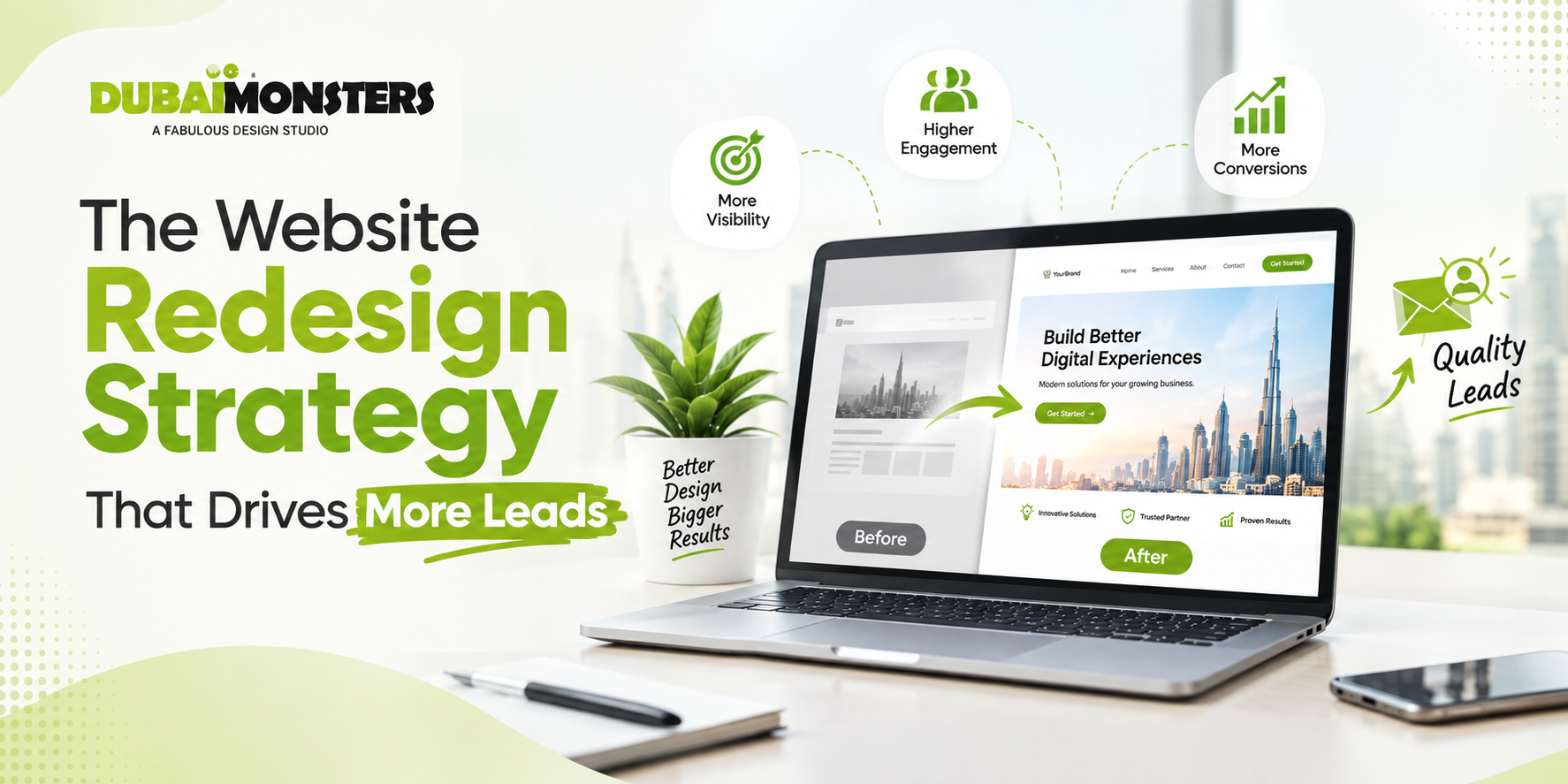
A website redesign should be treated as a conversion and business-growth project, not a visual makeover. Every element should be well aligned to create create a visual appeal.
The strategy that actually works for website redesign is: Audit → Understand → Restructure → Design → Optimize → Test → Measure.
Let’s break down this strategy further to generate more leads.
Table of Contents
A traditional redesign and a lead-driven website can look almost identical on the surface. But they’re built on completely different logic Here’s what the real difference is.
| Traditional Redesign | Lead-Driven Redesign |
| Focuses on appearance | Focuses on business outcomes |
| Starts with visual concepts | Starts with data and research |
| Generic CTAs | Intent-based CTAs |
| Page-by-page thinking | Funnel-based thinking |
| Measures traffic | Measures qualified leads |
| Launch is the finish line | Launch begins optimization |
A successful redesign isn’t something you can hand off to a single designer and expect great results. It requires complete revamping of the website.
Be it design, development, SEO, or user experience, it’s important to work together not as separate checkboxes ticked off in sequence.
The urge to jump straight to redesigning the homepage can hurt your brand authority. Resist it. You can’t fix what you haven’t measured. Here’s what you should do instead.
Before touching a single page, pull the data on:
When it comes to redesign you don’t always need to change everything.
Identify which pages are actually generating leads, CTAs that get clicked, qualified prospects content pieces to get better conversion rate.
This distinction means: you don’t have to redesign every single page.
These existing pages can be one of your best converting pages. Get a close look at existing traffic, conversions, leads, sales, and heatmap behavior before you make any major change to the website.
A redesign should start with identifying your ideal customer, not with the homepage layout.
This means getting specific to your buyer personas. Understand their pain points, purchase intent, common objections, how they make decisions, and what information they need before they’ll contact you.
Not every visitor is at the same stage. Some of them might be casually visiting while others might be ready for conversion. Break them into groups:
Each of these groups often needs a different page, a different message, and a different CTA. A visitor who’s just researching shouldn’t see “Get a Quote” as the CTA. Come up the high converting strategy for your brand to drive real leads.
Explore: Website Design Cost in Dubai
This is where the real strategic conversion actually happens.
This is the actual conversion journey: Search/Social/Ads → Landing Page → Relevant Information → Proof → CTA → Form/Call/WhatsApp → Lead → Sales Follow-Up.
Once that path is mapped, you can start identifying exactly what is actually causing the friction.
A redesign is your chance to rethink the entire information architecture, not just rearrange the same pages under a trendy template.
A structure like this tends to work well:
Homepage → Service/Product Pages → Industry/Solution Pages → Case Studies/Proof → Resources → Contact/Consultation
Pay attention to clear navigation labels. Start by creating a logical page hierarchy and shorter paths to your most important pages to improve the overall performance.
Moreover, it’s important to create relevant internal linking, compelling landing pages, and conversion paths for specific services, making crawling easy.
No amount of visuals can make visitors stay. You need to craft a compelling brand message that doesn’t land in no man’s land. Understanding the customer’s journey and tailoring the content as per their requirement can be a real breakthrough.
Your hero section needs to answer four questions almost instantly: What do you offer? Who is it for? Why should they choose you? What should they do next? These questions will help you identify brand voice and authority.
Every important service page should include a clear value proposition and identify customers’ pain points. These are benefits you should deliver. From development process to relevant features, and case studies signal authority.
More content isn’t the goal; more useful content is. If a page doesn’t help a visitor move closer to a decision, it’s meaningless.
If every button on your site says “Contact Us,” you’re leaving conversions on the table.
| Visitor Intent | Better CTA |
| Early research | View Solutions |
| Evaluating options | See Our Work |
| Comparing providers | Compare Solutions / View Case Studies |
| High intent | Get a Quote |
| Ready to talk | Book a Consultation |
| Immediate assistance | Call / WhatsApp |
Think about primary versus secondary CTAs, where they’re placed, how they’re worded, whether they stick on mobile scroll, and whether they appear contextually within the content itself rather than only at the bottom of the page.
Great traffic can still translate into a weak pipeline if the last step.
Focus on shorter forms. Add only relevant fields with strong form headlines. This provides privacy reassurance, good error handling, mobile-friendly inputs, and a smart thank-you page.
Picture the shift from a high-friction form (ten fields, no context, generic submit button) to a low-friction one (three fields, a clear headline, a privacy note, and a specific next step).
Visitors need a reason to believe you before they’ll hand over their contact information.
That trust comes from client logos, testimonials, reviews, case studies, certifications, awards, years of industry experience, portfolio samples, hard numbers, and guarantees where they make sense.
Don’t just dump all of this in a single “Testimonials” page. Spread trust signals through the journey wherever a claim needs backing up: Claim → Evidence → CTA.
Mobile responsiveness isn’t a final checklist item; for most businesses, it’s where the majority of traffic actually happens.
That means thumb-friendly navigation, readable typography, fast-loading pages, short forms, easy-to-tap CTAs, sticky contact options, properly sized images, mobile-specific layouts, and avoiding intrusive pop-ups that frustrate people mid-scroll.
The sources agree here too: mobile usability isn’t optional in a modern redesign; it’s foundational.
This is the section that separates a genuinely useful redesign guide from a generic one, because SEO is so often an afterthought, and that’s exactly when rankings quietly disappear.
Crawl the existing site, export important URLs, identify which pages are ranking, note existing backlinks, review metadata, preserve valuable content, and map old URLs to new ones.
Implement 301 redirects, maintain internal links, check canonical tags, update the XML sitemap, preserve structured data where relevant, check robots.txt, and monitor indexability throughout.
Monitor rankings, check for 404 errors, review organic traffic, compare landing-page performance, and watch for indexing problems.
Speed isn’t just a developer’s concern or an SEO checkbox; it’s directly tied to lead generation.
Cover Core Web Vitals, image compression, lazy loading, script reduction, caching, CDN setup, clean code, hosting quality, and mobile performance.
The funnel logic is simple
You can’t optimize what you can’t see, and this step is often skipped entirely.
Track CTA clicks, form starts, form completions, phone clicks, WhatsApp clicks, bookings, downloads, scroll depth, key page journeys, lead source, lead quality, and conversion rate.
Before launch, record your current traffic, current conversion rate, current lead volume, and current qualified lead numbers. Without this baseline, you have no real way to know if the redesign actually worked.
Don’t let your visitors be the ones who discover the problems.
Run through a pre-launch checklist covering desktop testing, mobile testing, cross-browser testing, form testing, CTA testing, navigation testing, speed testing, accessibility checks, broken-link testing, SEO checks, analytics validation, and redirect testing.
Wix also recommends ongoing review and A/B testing after launch, treating it as the start of optimization, not the finish line.
A redesign is not a one-and-done project.
First 30 days: watch for technical errors, organic traffic shifts, conversion rate changes, lead volume, form abandonment, and general user behavior.
30–90 days: identify high-performing pages, weak conversion paths, underperforming CTAs, new search opportunities, and content gaps, then keep testing.
Ongoing A/B tests should cover headlines, CTA copy, form length, page layouts, trust signals, pricing presentation, and other landing-page elements.
A redesign has a way of going wrong quietly. Nobody notices the damage until three months post-launch, when someone finally asks why the leads dried up. Here’s where it usually happens.
Each of these mistakes is avoidable with the right process in place, which is exactly why an experienced web design agency in Dubai builds testing, tracking, and SEO safeguards into the redesign from the start, rather than treating them as cleanup work after launch.
Vanity metrics like raw traffic don’t tell the whole story.
Primary KPIs: lead conversion rate, qualified lead rate, cost per lead, sales-qualified leads, form completion rate, consultation bookings, and revenue influenced by website leads.
Supporting KPIs: engagement rate, organic traffic, landing-page performance, CTA click-through rate, page speed, and mobile engagement.
Website Conversion Rate = Leads ÷ Website Visitors × 100
Lead quality and revenue matter far more than simply pushing up the number of form submissions; ten highly qualified leads will always outperform a hundred people who were never going to buy.
A website redesign succeeds when the new site doesn’t just look better — it makes it easier for the right people to understand, trust, and choose your business.
That comes from following the full strategy end to end: Research → Strategy → UX → Content → Design → Development → Conversion → SEO → Testing → Optimization.
If your site is getting traffic but not turning it into leads, the fix usually isn’t more marketing spend; it’s a web design agency in Dubai that treats your redesign as a growth project, not a facelift. That’s exactly the approach Dubai Monsters takes with every project.
Get in touch with our team today to build a solid strategy that drives real leads!
Mahnoor Khan
September 30, 2026  Mahnoor Khan
August 18, 2026
Mahnoor Khan
August 18, 2026 Table of Contents
