

 Mahnoor Khan
 October 13, 2026
 Junaid AshrafFebruary 21, 2025
Designing a logo involves more than choosing the right shapes and fonts.
The color palette is a vital part of the brand’s identity. Each color carries its own associations and emotions. Colors have the ability to influence behavior and the decision-making process too.
The color spectrum is wide and many colors can be chosen from. Choosing the brand’s color palette does sound daunting.
Let’s begin by choosing the right logo color schemes for your brand to create a unique identity. See what each color say, how cultural context changes the message of your brand.
Table of Contents
What does talking about branding bring into people’s minds? It’s a logo! A logo is indeed crucial but so are the brand’s colors.
Consider the case of an individual in a supermarket walking down the sauces aisle and seeing a wide variety of sauces and colors right in front of them.
What does the individual recognize first, especially if they want a bottle of ketchup or a bottle of Tabasco sauce? The iconic Heinz and McIlhenny’s Tabasco. Heinz’s red is hard to miss, and Tabasco has its own look that shoppers know at a glance.
Both are recognizable, right?
Yes, they are. Heinz decided to fight ketchup fraud, where restaurants refill Heinz bottles with other brands. The brand identified the exact Pantone code of its ketchup and added a matching border to the label, so customers could check that the ketchup inside matched. Let’s breakdown all the factors.
Heinz’s iconic logo is built around a bold red. Indeed certain colors help the brand be recognized instantly because after all, Ketchup is red. Think of it as the brand’s superhero outfit. Whenever people see the colors and fonts, they know it is that brand (Heinz) standing out in the crowd.
Colors make people feel things. Red is linked with passion and energy, which can get the blood pumping. Blue tends to make people feel calm and trusting, whereas grey suggests balance and neutrality. This is why choosing the correct colors is important as it helps the brand make an emotional connection with the audience.
The ads, business cards, logo, social media pages, and websites must all use the same colors and color schemes. It helps create a feeling of consistency and unity. This makes the brand feel more professional and trusted. Our corporate branding services help brands keep their colors consistent across every touchpoint.
Read more: How to build a strong brand identity from scratch
The brand’s colors help companies stand out from the rest of the crowd. In case everyone is using blue and grey, using a bold yellow, or a vibrant green, or shiny black can make the brand’s logo unique. Do a quick audit of your competitors’ logos before you pick your own, so you know what the market already looks like.
The science of colors holds quite an influence on branding and logo design. Colors are beyond aesthetics; they evoke emotions and associations. They can also influence perception. Selecting the right color palette is key for communicating the brand’s identity. It also resonates with the target audience. It is part of cultural understanding and psychology undoubtedly.
Different colors trigger different responses, and we break down the most common ones in the color psychology section below.
Thus, choosing the perfect palette for the logo involves a careful balance of color psychology, cultural understanding, and of course, brand identity. It is a tactical decision that can have an effect on the way a brand is perceived and remembered.
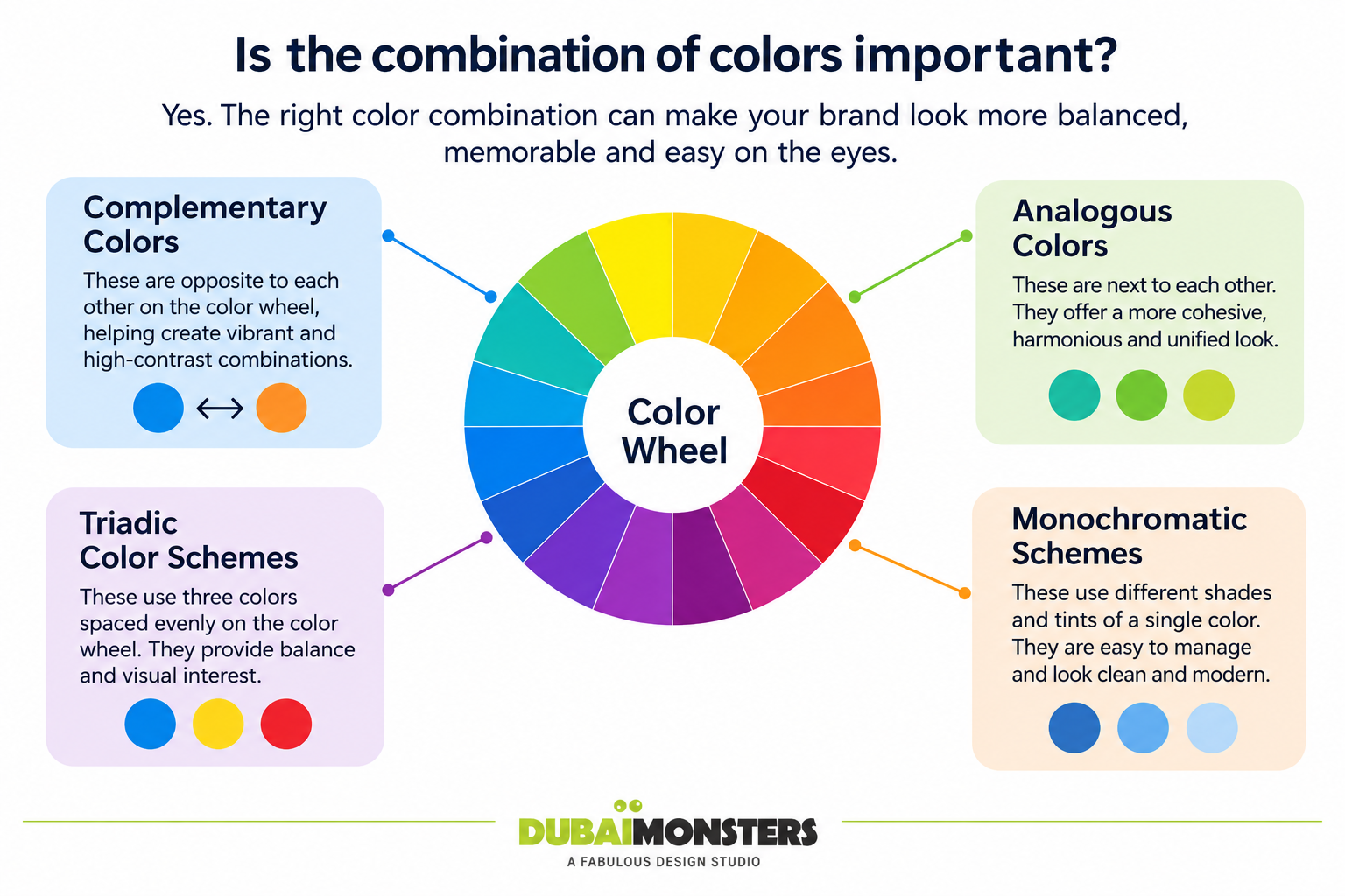
Going beyond individual colors, the color combination in the palette matters quite a lot. Understanding these relationships allows for the creation of intentional palettes.
Cultural context also plays a role in the understanding of colors. Red symbolizes luck in some cultures while in some it represents mourning. White is associated with purity in some but in some Eastern cultures, it is associated with bereavement. This is why researching cultural connotations of selected colors within the target market is key. It helps avoid misunderstandings on various scales.
If your audience is in the UAE or the wider Gulf region, keep local associations in mind. Green is often linked with nature, prosperity and Islamic heritage, and gold is widely tied to luxury and wealth.
Treat these as starting points rather than rules, and test your palette with the people you want to reach.
The brand’s personality and values should be given due consideration. A brand that is energetic and playful can opt for a color palette that is bright, energetic, and vibrant. A luxury brand with a complex and sophisticated taste can choose an elegant, muted, and refined color palette.
Professionals of logo design Dubai further explain that the logo’s color palette should represent the brand’s essence visually.
In logo design, a proper understanding of color psychology is very important. Colors aren’t just aesthetically appealing but rather they can communicate on a subconscious level. They can evoke emotions and can affect human perception too.
This is why a properly chosen color palette can make a brand’s identity very strong. It can attract audiences and foster proper and robust associations. Keep in mind that these associations are tendencies, not rules, and they shift with culture and context.
This is why choosing the correct color involves proper research of cultural connotations of colors as avoiding accidental misinterpretations is important. It takes into consideration the following factors:
Hence a properly chosen color palette is a robust tool for communicating the brand’s message. This in turn creates a long-lasting impression too.
Color combinations have a role to play in brand recognition. They help convey a brand’s value. However, it should be understood that not everyone uses the same color schemes. They use specific color palettes to resonate with their audiences. Let us have a look at some key examples:
Knowing what colors mean is only half the job. Here is a simple process you can follow.
Tools like Adobe Color, Coolors and Canva’s palette generator can help you explore options. If you are curious about AI-assisted tools in the process, see our guide on
Read more: How to leverage AI tools for professional logo design
These are starting points, not rules.
| Mood | Palette | Notes |
| Trust and professionalism | Navy #0A2540, Sky blue #5B9BD5, Light grey #F2F4F7 | Works well for finance, consulting and tech |
| Appetite and warmth | Red #D62828, Golden yellow #FCBF49, Cream #FFF8EC | Use the yellow for accents, not text |
| Calm and natural | Forest green #2D6A4F, Sage #95D5B2, Off-white #F7F9F5 | Good for wellness, eco and organic brands |
| Luxury | Black #111111, Gold #C9A227, Ivory #FAF7F0 | Keep the layout simple so the palette feels premium |
Not sure which colors fit your brand? Talk to our designers can help you build a logo and palette.
Creative variations and unique color combinations are vital for brands. They help them stand out. Color psychology also plays a key role because different colors evoke different associations, emotions, and reactions.
Researching the audience’s preferences and cultural interpretations of color is indeed important. There are various tools and resources to help in this matter. Hence, the best color combination for the brand depends on a careful balance of industry trends, brand identity, and of course, color psychology.
When you are ready to turn your colors into a complete logo, contact Dubai Monsters and our team will help you build one.
Most strong logos use between one and three colors, plus a neutral. Fewer colors are easier to remember, cheaper to print and simpler to keep consistent across your website, packaging and social media. A good test is whether your logo still works in a single color.
Mahnoor Khan
October 13, 2026  Mahnoor Khan
June 12, 2026
Table of Contents
