


 Mahnoor Khan
  June 12, 2026
  Mahnoor KhanDecember 3, 2025
Instagram is the 3rd most popular social network in the world, with 2 billion active monthly users. But that’s not the only thing that makes this social media app popular.
The gradient logo design is what captures the attention. The unique blend of colors makes this app instantly attractive. Modern branding is all about creating a visual identity that is hard to resist. And a logo is an identity that creates a perception about your brand. The depth, richness, and polished look of a logo create a contemporary feel that makes your brand stand out.
This is why staying aware of current design trends matters, especially when working with logo designing services in Dubai. Gradients are one of the most powerful design approaches that can reshape the overall impact of a brand.
Let’s explore how color smoothness, shine, and texture can elevate a logo. Moreover, how can you use them effectively?
Table of Contents
You might think that gradients are the new trend.
But they have always been around. Brands today are re-exploring gradient colors when it comes to logo design.
Logos today must do more than look good. They must be able to capture attention instantly and reflect the brand story. The crowded markets must provide seamless adaptation of screens, platforms, and devices to make the design unique.
That is where gradient and shiny logo design effects excel.
Visual elements like color and texture can influence 85% of consumer purchasing decisions. This proves that a distinct logo style can be used for brand recognition.
Furthermore, over 60% of newly launched global brands in the last three years incorporate gradient or dimension-based elements.
In other words, smooth color transitions and metallic finishes are not just aesthetic preferences; they have become strategic branding tools.
A gradient logo can use a smooth color transition.
It offers a blend of two or more hues that create depth, warmth, or energy. This type of color gradient branding is especially popular among digital-first brands that want a dynamic, vibrant look.
Below are some of the strongest reasons gradient logos resonate with modern audiences:
One of the biggest advantages of gradient logos is their ability to create a sense of depth without complicating the design.
The smooth and gradual color shift produces a natural three-dimensional effect, making the design visually more appealing and intriguing.
Let’s take an example of an Instagram logo to see how smoothly your gradient logo should transition from one color to another.
This subtle visual transition can help draw the viewer’s attention longer, which means creating a valuable online environment where attention spans are shorter than 3 seconds.
Brands that position themselves as creative, forward-thinking, or tech-driven are moving towards gradient logo design. These smooth transitions symbolize movement, digital evolution, and innovation. But for such an innovative design brand to use color psychology to design a logo.
See? The color report shows the preference for a brand when designing a logo. This blend of colors communicates that a brand is not static; it is active, dynamic, and ready for the future. This feature is especially important for startups, SaaS products, lifestyle brands, and creative agencies. Using this method can help you create a more impactful logo.
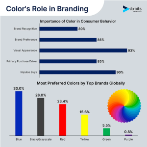
As the social media platform becomes more popular, the importance of a good logo has significantly increased.
With a gradient logo design, brands can hold visual appeal regardless of size, making them ideal for app icons, website headers, and social profile images.
Unlike the complex textures or detailed illustration, gradients can instantly make the logo appear more rich and exclusive. Modern design software and screens also enhance gradient logos, making them appear more dynamic.
Not just gradient logos, but metallic logos are also gaining traction. These metallic logos bring a sense of luxury, craftsmanship, and sophistication.
Metallic effects replicate gold, silver, bronze, or chrome, giving logos a high-end finish that reflects royalty.
Businesses in industries such as real estate, fashion, beauty, automotive, and hospitality increasingly favor metal-effect logos for their premium visual appeal.
There is a psychological association between metallic tones and premium value. Gold screams luxury. Silver speaks to innovation and refinement. Whereas copper evokes warmth and elegance.
Implementing these metallic textures instantly shifts the audience’s perception of a brand into a more upscale category.
By giving a logo a shiny or brushed metal effect, brands create a strong first impression that aligns with exclusivity. This is particularly effective for high-end retail brands, luxury services, and companies wanting to increase perceived value.
The shiny logo design creates an enchanting charm that instantly grabs attention. The metallic effect gives the logo a distinctive, visually rich finish. It looks best when used on printed materials such as business cards, signage, and packaging.
In the digital space, 3D metallic effects can create a bold, glossy aesthetic that makes the logo feel more alive. Many brands use metallic effects in animations, motion graphics, or website headers to emphasize movement and light play, making the logo even more memorable.
Metallic logos reflect stability and strength. These metallic elements subtly communicate that the business is reliable, stable, and built to last. This makes the metallic logo style popular among industries that reflect strength or longevity. You can think of construction companies, car manufacturers, machinery businesses, and technology brands.
Companies that use metallic elements benefit from an identity that feels both powerful and trustworthy.
The gradient logo design is adapted by many brands. This trend is now trending among popular brands and creating an impact. Let’s take a look at some of the most popular brands using gradient logo design.
The Microsoft Edge logo uses a cool blue gradient transition with subtle shading. It gives a sense of movement and depth to the logo. This design communicates fluidity and exploration, aligning with the browser’s purpose. The gradient enhances the logo’s shape and dimension, making it instantly recognizable.

Tinder’s popular flame icon represents the warmth of the gradient logo. The smooth transition from pink to orange captures the lively, energetic tone of the app. The gradient reflects the brand’s identity. It communicates the chemistry and social interaction of this brand. It works particularly well against dark backgrounds and app interfaces.

Firefox’s transition from a detailed fox illustration to a gradient-based flame design demonstrates how gradients can simplify a brand’s look without losing identity. The new logo maintains the energy of the original while embracing a more modern and digital-friendly approach. The gradient enhances the concept of motion and warmth.

So, what’s your pick? While both gradient and metallic logos offer powerful visual advantages, it all comes down to brand preference. Choosing the right style depends on your audience and brand personality.
Here are a few considerations you need to make before making a decision.
A modern and digital-first identity is the need of the time. This modern world demands digital spaces, apps, e-commerce, SaaS, and lifestyle platforms. Using a gradient logo can help you connect quickly with tech-savvy audiences. The smooth color transition feels innovative and energetic, making it an excellent fit for trendy brands.
Businesses offering premium services or high-value products can use a metallic logo design for branding. The shine and reflection elevate the perception of value, making metallic logo effects ideal for beauty salons, real estate companies, boutique brands, jewelry stores, and premium hospitality businesses.
Can’t pick between metallic or gradient? You can blend in both to create a hybrid identity. This combination can deliver both depth and luxury. Moreover, you can choose hybrid logos to create digital media or print elements like embossed business cards or premium packaging.
The gradient and metallic logo have to be the core of the gradient branding.
Gradients create smooth color transitions that feel vibrant, dynamic, and digital-forward. The metallic textures add shine, depth, and luxury to your brand.
Both styles have proven effective for global brands across various industries, and both continue to shape modern design standards. The cutting-edge, premium, youthful, and strong presence creates a visual style that allows you to achieve your business goals.
And if you’re a brand based in a competitive market like Dubai, you need a branding strategy that outshines your competitors. With the right design approach, these textured and dimensional styles can help any business to stand out, communicate value, and build a memorable brand that marks its presence.
Mahnoor Khan
June 12, 2026  Mahnoor Khan
February 2, 2026
Mahnoor Khan
February 2, 2026 Table of Contents
