


 Mahnoor Khan
  June 12, 2026
  Junaid AshrafJuly 8, 2025
Logo represents your brand.
It’s that entity which is going to appear in different places on your website.
A logo will be an integral part of your website’s front page, it will be embedded on your merchandise and will be effectively used for marketing. It’s that one single entity which may appear as a small asset but holds significant value. Your brand’s value, products, audience, industry, background and even personality, all ties up to your logo design making it an essential part of your strategy.
In this in-depth guide, we will walk you through the branding and logo design process.
Hopefully, once you have read the article, we are sure that you will learn the nuances of logo design. From choosing the right colors and making the logo design itself – you will be well aware of how you can create a business logo from scratch. So, without further ado, let’s read everything we know.
Table of Contents
Your logo is the face of your brand. It’s the first thing that people interact with to recognize what your company is associated with truly. A well-designed logo creates a strong first impression of your business. It sets the perfect tone for how people perceive your brand.
It also adds value to your overall brand recognition.
A memorable logo design is like the one outside McDonalds or KFC will constantly remind you what the brand is about. You will also be able to build trust and credibility.
A professional logo design will also signal legitimacy and reliability.
Overall, a decent logo design is a mixture of colors, typography, and a symbol that conveys your company’s mission and sets its identity.
In fact, many marketing firms believe a consistent logo is what strengthens your business advertising & streamlines branding across platforms.
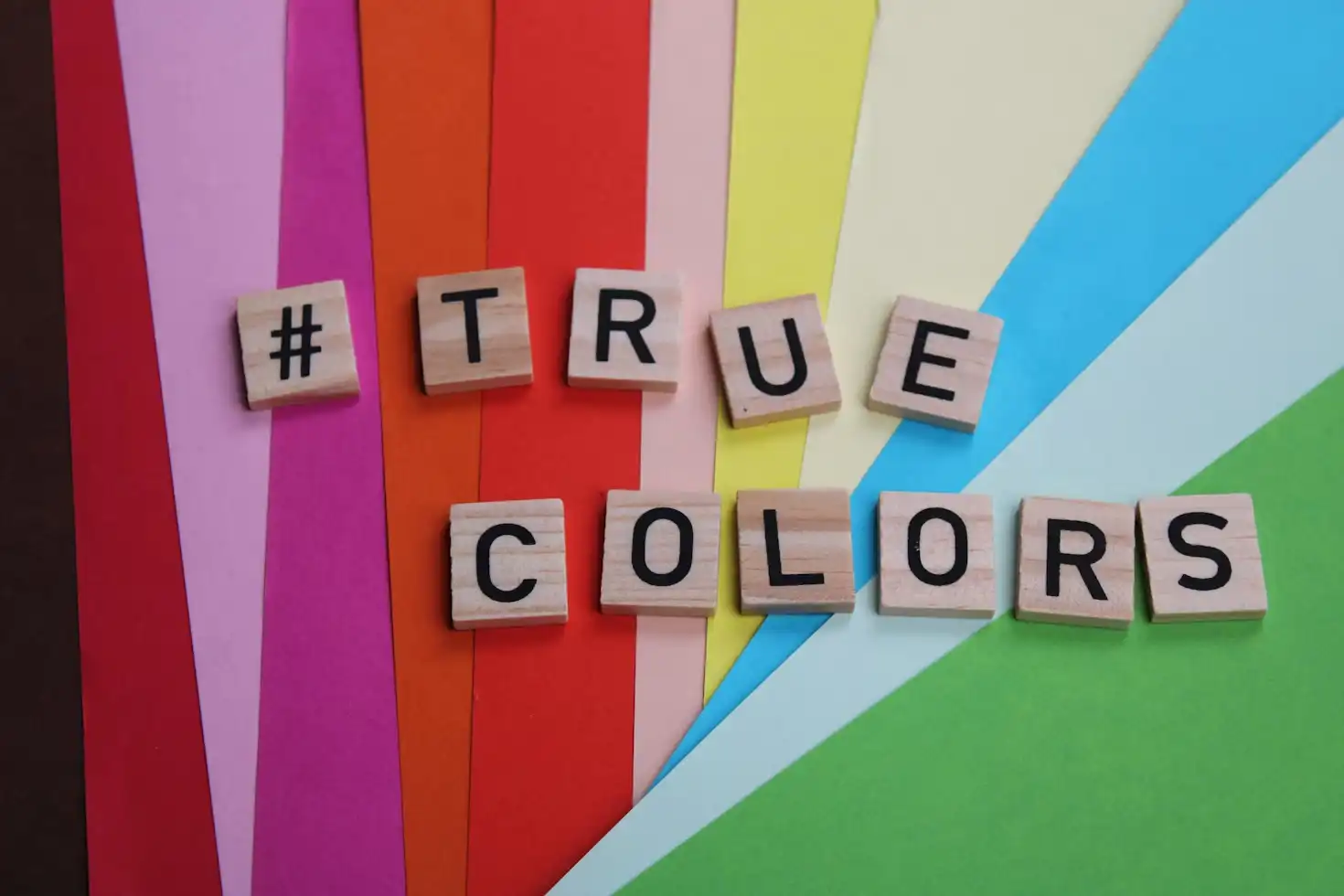
A beautifully designed logo doesn’t just appear good; it sparks emotions and shapes a viewer’s perception. Believe it or not, color psychology is important in deciding how your logo will change the viewer’s perception. For instance, the color red is everything about passion, excitement, and urgency, which is one of the reasons why brands such as Coca-Cola and YouTube use it so prominently. Similarly, Blue shows trust, stability and professionalism.
That’s why you will use it in logos for Facebook, LinkedIn, and IBM. And let’s not forget Green, the color which is all about growth, health and nature.
Green is the prominent choice for brands like Starbucks & Whole Foods. Lastly, we have yellow (my favorite), which radiates optimism, energy, and friendliness.
Just look at McDonald’s and Snapchat—yellow is impossible to miss!
Apart from colors, shapes also play an integral role in defining the true value of your logo. The correct shapes within your logo sends a strong message of what your brand exhibits.
For example, if your brand is everything about community and connection, you can use shapes like circles and ovals to symbolize unity. Pepsi and Mastercard are two renowned examples.
Squares and rectangles, on the other hand, exudes a sense of stability, professionalism, and strength. That’s why brands like Microsoft, American Express, and The Lego Store rely on them.
Last but not the least, Triangles share innovation, power and movement. You can think of Adidas or Toblerone – their triangular elements scream progress & momentum.
When investing in a logo design, one must ensure the logo is simple, easily recognizable, and well-understood at a glance.
Think about Apple’s logo – at a glance, it may appear as an apple with a bite taken out, yet it instantly conveys a strong message, an inspiration that provides clarity with minimalism.
Similarly, Nike’s swoosh is another excellent example. It’s simple, a flowing check mark which represents motivation & movement. Nike and Apple have logos that are highly recognizable.
The second is memorability. A logo needs to be unique and memorable to stand out.
The third principle of a winning logo is how it is versatile. The versatility of a logo depends on how it appears in merchandise of different types & sizes. For example, it depends on what your logo will appear like on business cards or billboards. One decent example is McDonald’s golden arches. Whether displayed on a massive billboard, a tiny business card, or an embroidered dress of an employee, the yellow arches are a simple yet bold design that is easily recognizable in all sizes & formats.
When designing logos, you can also avoid trends that make it appear outdated too soon. Ensure your logo is relevant and perfectly aligns with your overall brand’s personality & industry.
To be specific, there are seven different logotypes.
Each of these logotypes is a combination of typography and images. A good logo combines strong visuals with correct typographic elements to ensure it gives your brand a fresh appearance.
Here are all the seven different logos discussed.
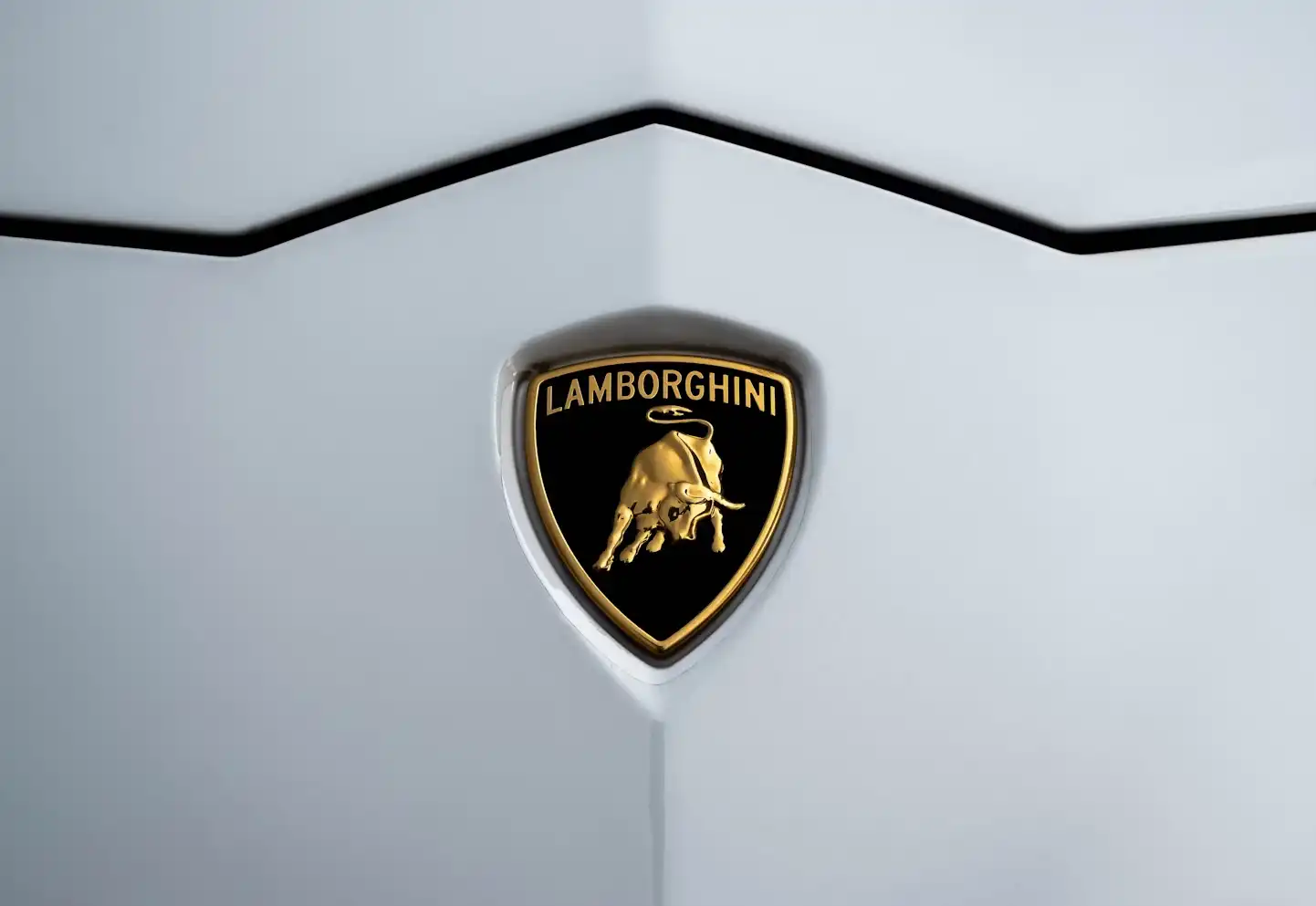
Emblem logos are specific logo types which contain text inside a symbol.
Such logos often have a traditional and authoritative feel which is why they are abundantly found popularly among schools, government agencies and luxury brands.
A few notable examples of emblem logos are Harvard University, Harley-Davidson, Starbucks and so on.
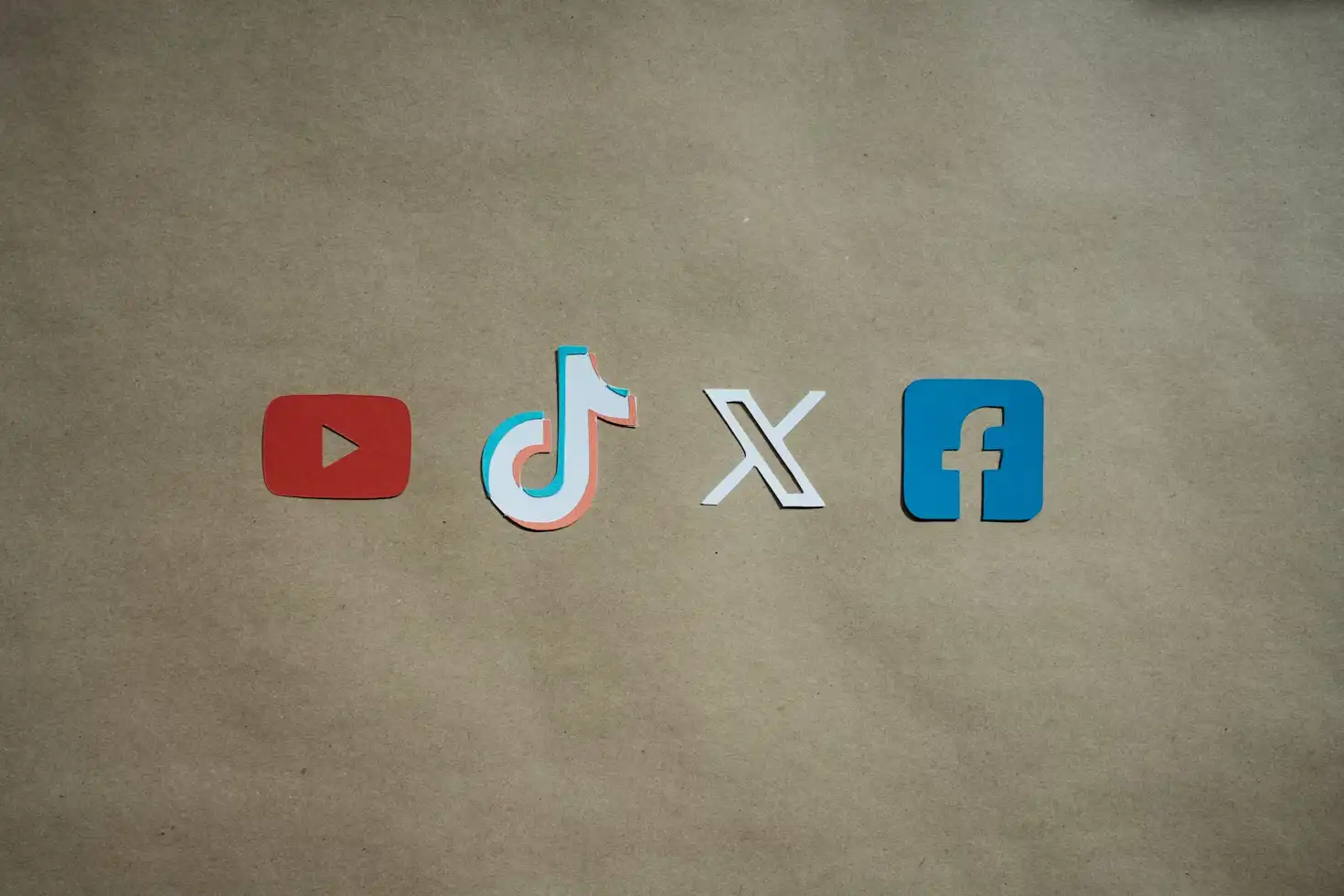
The next type of logos are brand marks.
These logos are made of a single recognizable image or icon.
They require little to no text. Pictorial mark logos mostly rely on strong visual identity, which makes them effective, especially when the brand is well-known.
A few good examples of pictorial mark logos are logos of famous companies like Apple, Twitter, and Target. All these logos convey their message using strong imagery.
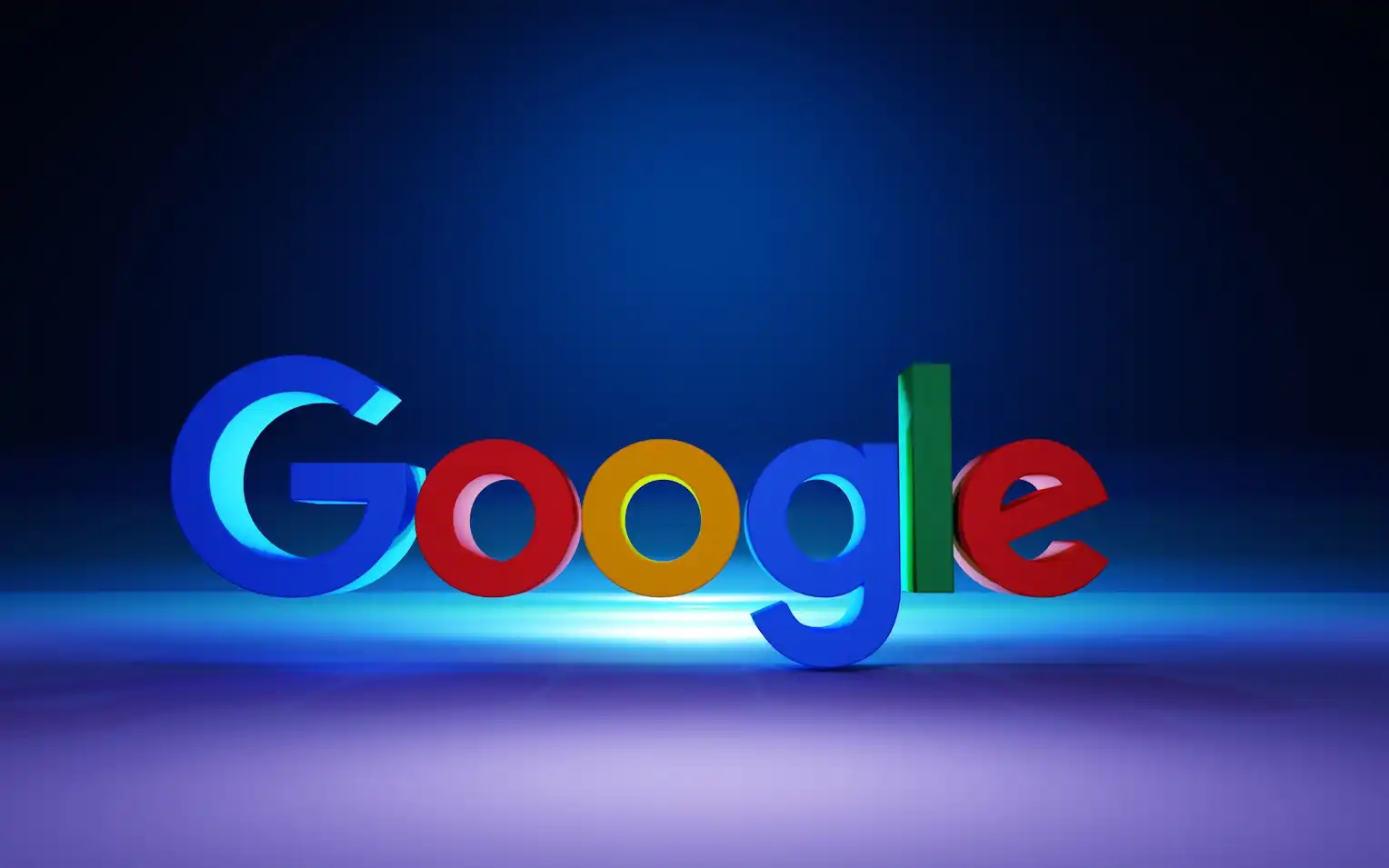
Wordmarks, also called logotypes, focus on stylized typography.
The aim is to represent a brand. They normally use the name of the company or a brand as the primary visual element. Wordmarks are quite useful in communicating a brand identity.
They normally use custom lettering, unique fonts, and creative typography treatments. Since Wordmarks are bold and recognizable, they are found in brand logos like the Disney or Coca-Cola logo and the modern FedEx logo. Explore a variety of similar logotypes & you will find many options.
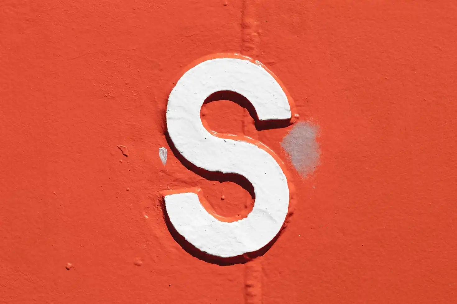
Lettermark logos are also called monogram logos.
Monograms are basically abbreviations or initials of a company’s anime.
They are designed uniquely typographically and are remarkably great for long-name brands.
Such logos are easily recognizable. A few good examples of these logos are IBM, HBO, and NASA.
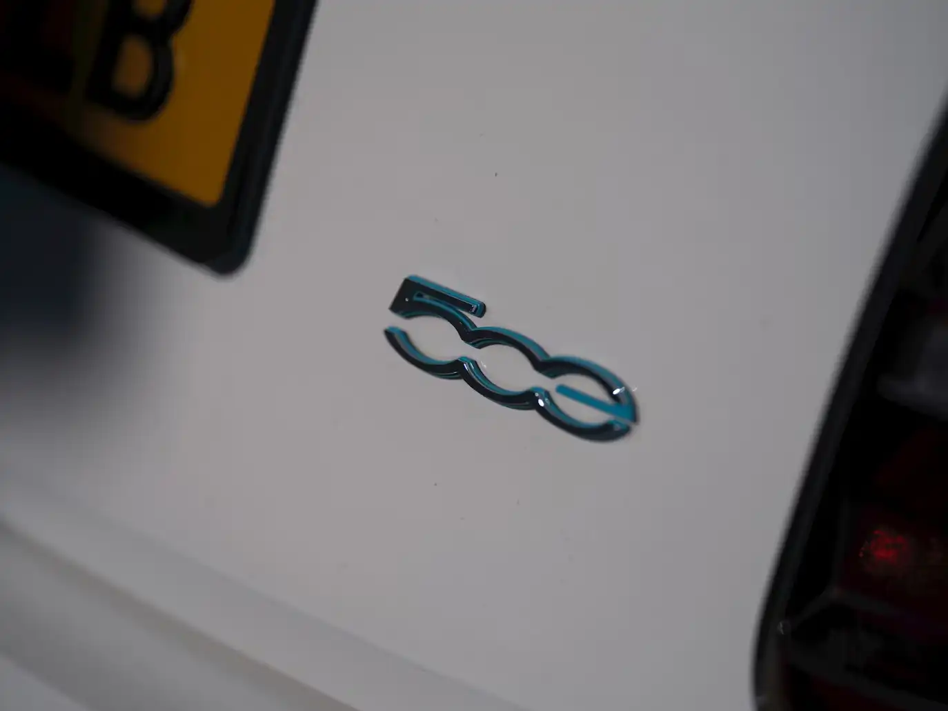
Abstract logos are geometric and symbolic designs. They don’t directly relate to a real-world object but back a powerful concept. These logotypes are often used when you want to establish the perfect brand identity. They are flexible and can come out to be highly unique.
For example, some websites that use abstract logos include renowned brands such as Pepsi, Adidas, and Airbnb.
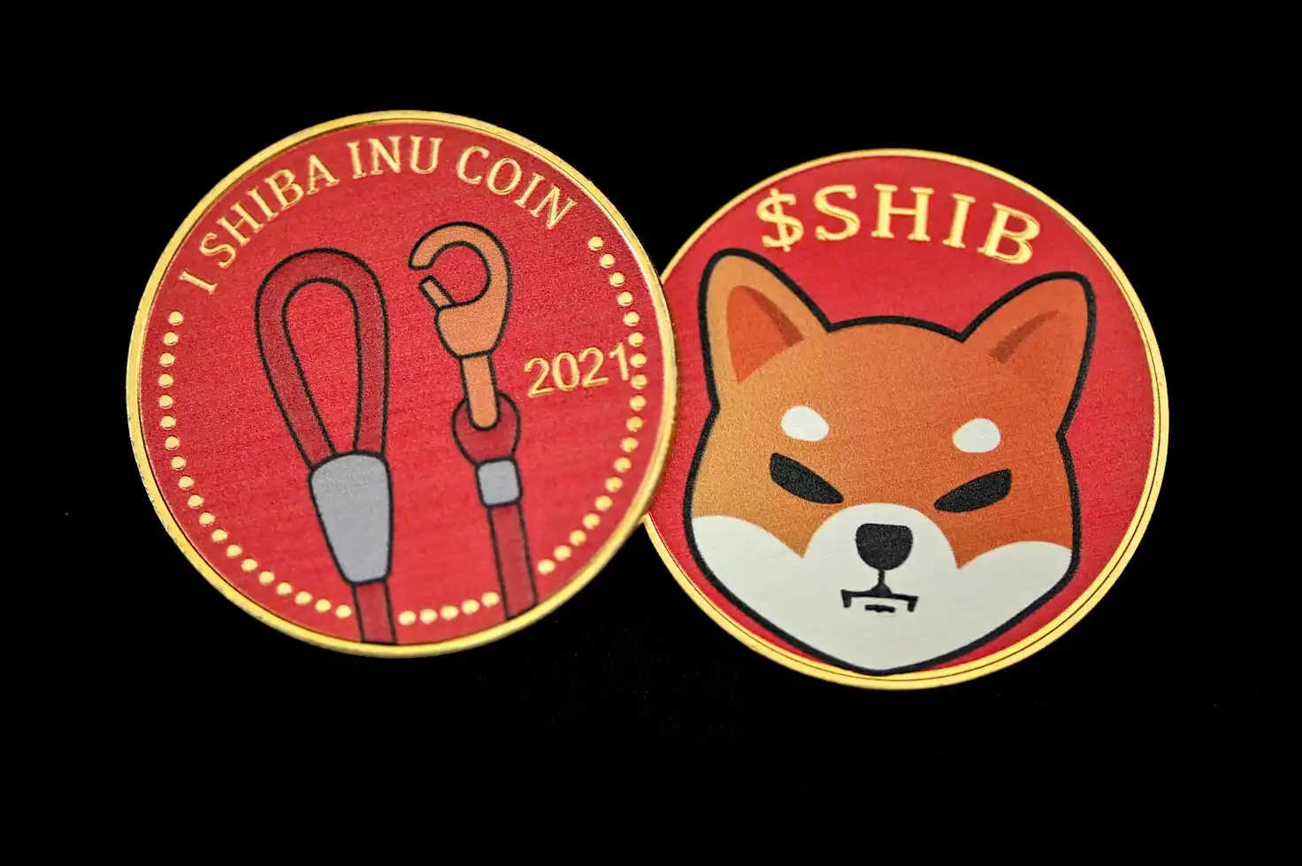
Mascot logos are illustrated characters.
These logotypes often place your brand in a friendly and engaging manner.
Logos which fall under the Mascot category are developed for fun. You will find mascot logos abundantly in the sports industry, food brands and many similar itineraries.
For example, KFC’s Colonel Sanders logo is a great example where they use the old man’s mascot as a representation of their brand. Similarly, the Pringle’s Mr. P is also a great mascot which they feature on their chip boxes. Let’s not forget the Michelin Man, all of these are great examples of Mascot logos.
Last but not the least, we have combination logo marks. They appear in the form of symbols and these symbols can be pictorial, abstract or mascot. You can use them as a text in a single design, or you can combine it with visuals and other dynamic elements to make it appear more versatile. Brands which are familiar with combining icons and text together or separately are quite predominantly found as combination logos. Some of the good examples which I can quote for combination logo marks include the one they have at Burger King. The subtle Burger with the bold font of the Burger King just sets the tone right. Similarly, we can also find Doritos where a chip featured on the front bag of the Dorito with a triangle shaped element makes the tone of the brand more engaging. One of my favorites is La Coste where a simple alligator appears on the front-side of the t-shirt.
Each logo type mentioned above is specifically categorized to offer your brand the perfect visual feel and the best appearance. Whether you wish to believe it or not, logos are the first thing your customers will see and it’s the single most important thing that brands focus on.
A great logo doesn’t happen by accident—it’s the result of a structured and well-thought-out logo design process. Here’s how professional designers approach it:
Before putting pen to paper, designers study the brand inside out to find out whether the logo they are about to invest in is going to perfectly align with the company’s identity or not.
They ask themselves a series of question by putting themselves in the shoes of the company:
Somewhere in the back of their mind, they understand that logos should visually communicate what the brand is about. For example, a law firm needs a professional, authoritative logo (e.g., a serif font and balanced structure), while a bakery might have a more playful, handwritten style.
Next, they always consider a logo must appeal to the people it’s meant for. Believe it or not, but different audience types resonate with different colors, shapes and logo styles. You can’t get a one-size-fits-all approach when it comes to logo designing, so think about it: a tech startup targeting Gen Z might require bold/futuristic typography and much more vibrancy in colors; whereas a luxury brand for high-net-worth individuals might lean toward minimalist black-and-gold aesthetics.
Another thing that many designers bring into consideration is how the logo influences brand perception. A good logo isn’t just about colors, shapes and fonts triggering one or more psychological responses, but it’s more about how it makes your people feel about that particular brand.
For example, the Red in Coca-Cola establishes a sense of energy and urgency. Whereas, the blue in Facebook or IBM establishes trust and dictates professionalism.
In the end, a designer also thinks whether a logo reflects the ethos and mission of the brand.
If in some manner, a logo is somewhat contradicting with the brand’s value, it leads to confusion and eventually weakens the brand’s overall trust leading to brand degradation.
The best example which I can quote here is of an eco-friendly brand which capitalizes on organic shapes and green tones. Whereas, an AI company often seeks modern geometric elements.
Brainstorming and conceptualizing are the heart of great logo design because this phase is where raw ideas are explored, refined, and turned into something meaningful.
So what truly happens during the brainstorming stage. Do they all sit around the round-table and do bouts to understand the science and psychology behind logo design?
Naah, here’s what most designers do when they get their heads in the game.
✔ Extract key themes from the brand’s identity and values.
✔ Explore multiple visual directions before narrowing down the best ones.
✔ Avoid creative blocks by bouncing ideas off each other.
Logo science is not just about drawing a sketch – it’s more about solving a customer’s problem. It’s about visually translating a brand’s true essence and ensuring it becomes a single mark.
Also Read: What Makes a Great Logo?
Now, you must be eager to learn and understand how a logo design team functions when they sit together with the client. Well, we will give you a walkthrough of how teams sit complacently with one another and come up with a logo design process that wins clients and customers for the better.
For this, we will take an example of a new eco-friendly meal kit delivery service, let’s say, called “GreenBite.” This company is all about health-conscious customers and wants to set a vibe with a fresh and modern logo design.
Step # 1: The Brainstorming Session Initiates
The team comes around together in a conference room. After a few casual comments with each other, they start on the whiteboard by adding words which describe the brand perfectly.
A few good keywords they realized were:
✔ Sustainable, Fresh, Organic
✔ Quick, Healthy, Eco-friendly
✔ Nature, Growth, Balance
These words were pretty strong inspirations for setting the themes for the best visuals.
Step # 2: The Team Explores Different Logo Styles
The second step is where the team discusses which logo type works best. While there are plenty of options, they brainstorm every single one of them to find one that best resonates.
For example:
✔ Wordmark? (Just “GreenBite” in a custom font)
✔ Pictorial Mark? (A simple leaf or sprout icon)
✔ Combination Logo? (Both text and a visual element)
One designer suggests: “A leaf in the shape of a bite mark could be cool—it merges ‘green’ and ‘bite’ into a single, clever symbol!” And trust me, it wasn’t a bad idea after all.
Step # 3: Preparing the Rough Sketch
Once, thoroughly brainstormed, it’s now time to fetch the best ideas, grab pencils and sketch pads and get to work – yes, you heard that right, no laptops yet! Each designer draws quick thumbnail sketches to explore different logo design types and put these design ideas to work.
So what does good logo sketches include:
✔ Maybe, a minimal leaf + bite mark 🍃
✔ A bowl with a sprout growing inside 🌱
✔ A fork forming the shape of a tree 🍴🌳
Another designer points out: “We should avoid overcomplicating it—something clean and easily scalable will work best!”
One way or the other, the goal should always be to ensure the logo works across multiple mediums, may it be app icons, packaging, billboards or social media without losing the nitty gritty details.
Step # 4: Shortlisting Anything That Works
Finally, the team pins their sketches on the wall and discusses the different pros and cons of each.
To get something that truly works, they need something that strikes a balance.
The final decision : A simple leaf with a bite mark—it’s clean, modern, and instantly communicates the brand’s purpose.
Oh and btw, who knows the bite marked clean and simple leaf may turn into something like Apple.
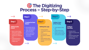
Once the best logo concept is chosen, designers transition from pencil & paper to professional design software (like Adobe Illustrator, Figma, or CorelDRAW) to refine the design to perfection.
The creation phase is all about achieving digital precision.
Before a designer gets into the design phase, they start with the vector-based software because vectors are scalable. When you design a logo on a vector base, you do it without experiencing any quality loss. Their next task is to set up artboards to better visualize the logo and how it will appear in different sizes. To achieve that, they import previously drawn hand-drawn sketches for references.
For example, a designer working on the “GreenBite” logo imports their sketch of a leaf with a bite mark and places it as a background layer. This overlay assists him to create a better design.
While working in collaboration with a brand strategist or a brand manager, a designer recreates the sketch digitally using clean vector shapes. They use Pen Tool or Shape Builder to draw curves, angles, and edges. They align elements using grids and guides for perfect proportions. They ensure symmetry is achieved and smoother connections are established between shapes.
For example, many designers make use of the Ellipse Tool to form the leaf outline and then subtract a crescent shape to represent the bite mark.
The refinement phase ensures the logo includes text (such as wordmark or combination mark) which the designer can use. They may start by picking legible, brand-appropriate fonts such as (Sans-serif for modern brands, Serif for classic, etc.). To achieve visual balance, designers often use Kern technique for adjusting space between letters. They also convert text into vector outlines & ensure the best scalability is achieved.
For example, the designer chooses a clean organic-looking sans-serif font for “GreenBite” and tweaks the letter spacing for balance.
The fine tuning phase is where the designer applies the right brand colors based on the color psychology principles which they have collected over the years. They test the logo in black and white first and keep transitioning between colors to ensure which color perfectly works. They also adjust stroke weights, check corners, and set spacing to ensure they have a polished finish.
For example, designers working on the “GreenBite” project will apply a grade of fresh green shade to the leaf and a dark brown for text, to make sure the logo looks naturally inviting.
Finally, when they are done with the initial design, the designer will test the logo in different formats. They will check if the logo design appears well on social media, app icons, website headers, business cards or other locations. They will resize the logo and save different versions in PNG, SVG, EPS, PDF and multiple other use cases. The final design they create will be presented to the client.
The designers preview how the “GreenBite” logo will appear on the website header, the food packaging and as an app icon before moving ahead to the final approval phase.
Well-designed logo is timeless. It’s versatile and memorable.
However, many designers fall into the common traps which often lead to an ineffective logo design.
Here’s a list of essential do’s & don’ts we need to understand.
A good thing about a winning logo design is it’s easier to recognize. A decent logo is one which has clean shapes, minimal elements and balanced spacing with enhanced readability.
For example, Apple’s logo is a simple bitten apple with no unnecessary details.
When your logo has a unique design, it will make it stand out from competitors.
A successful logo is one which is distinct in shape and has clever symbolism.
The best example of a memorable logo is FedEx’s hidden arrow.
Can you see it between the “E” and “X” representing speed & precision.
The best logo design is one which appears well on any size – may it be billboards or app icons. It means a great logo is when that’s scalable and you can test it how it will look in small & large formats.
For example, Nike’s swoosh remains recognizable in almost every size.
Colors can trigger emotions.
Designers often use a mix of colors such as red for passion, blue for trust and green for nature.
There are also subtle colors such as black & white. For instance, red in the Coca-Cola’s branding is what evokes positive energy & excitement in people who are willing to participate in its community.
When it comes to logo design, always invest in logo designs which are in vector format.
Vector format logos are present in (AI, EPS, SVG) which you can easily scale.
When resizing logos, make sure they don’t get pixelated or blurry during the scaling process.
For instance, logos developed in Adobe Illustrator remain sharp at any size.
Also Read: Vector vs. Raster: Which One is Best for Logo Design?
A good logo is one which reflects your brand’s original identity. For example, if you own a law firm, you should not have a logo that appears as a fast-food restaurant’s logo.
It’s why McDonald’s yellow arches are playful whereas Rolex has a crown logo which is prestigious.
A common mistake many logo designers often encounter is how they go after the trend and apparently, trendy logos age quickly and eventually lose their relevance.
Therefore, when you choose to invest in a logo, always aim for timeless design instead of short-lived fads.
A good example which I can quote here is how overusing 3D gradients (which were quite popular back in 2010s) make logos appear outdated.
What designers often fail to realize when designing logos is how they put too many details which often complicate the logo. Busy logos don’t scale well on screens which are smaller in size.
Stick to one or two fonts to establish a cohesive look.
To learn more about the best fonts for logo design check out our detailed article on:
Best Fonts for Logo Design in 2025
When designing logos, avoid using decorative or hard-to-read fonts.
For example, Disney’s custom script font using 5 different fonts would ruin its identity.
When it comes to logo designs, you don’t want to plagiarize someone else’s work. At the end of the day, you don’t want to find yourself dealing with legal issues or it can damage your credibility.
Always, try to establish a unique identity for the brand. For example, if you’re investing in a logo resembling another famous brand, your client can reject your logo design & contest it, legally.
One of the common mistakes that many logo designers often make is the use of generic icons. Using them can often make your logos appear unoriginal and something which you can easily forget.
Always invest in developing a custom and meaningful design, one that’s well established & great in appeal. For example, if you’re a sports good business & using a generic football icon from stock images, it won’t be sufficient enough to give your brand winning identity.
If you’re investing in logo design, make sure your logo appears good in different colors.
Try testing multiple variations, such as testing the logo in black & white or on different backgrounds. You can also test the logo on different materials such as business cards, websites, packaging & social media. For example, a highly detailed logo may appear well on a poster but it might be unreadable on an Instagram profile picture. You can ignore versatility, but it does play a central role digitally.
A well-thought out logo design is more than just a symbol.
It’s the face of your brand, communicating your identity, values and credibility in an instant.
Whether you’re launching a new business or rebranding, a strategic logo design sets the foundation for strong brand recognition and customer trust. At Dubai Monster, we specialize in designing impactful, custom logos which resonate with your audience and make a lasting impression.
Let’s bring your brand to life with a design that stands out in Dubai’s competitive market.
Ready to create a logo that speaks for your brand?
Mahnoor Khan
June 12, 2026  Mahnoor Khan
February 2, 2026
Mahnoor Khan
February 2, 2026 Table of Contents
