


 Mahnoor Khan
  September 2, 2026
  Mahnoor KhanJuly 22, 2026
Your website may be attracting plenty of visitors, but if your forms aren’t converting, you’re leaving valuable leads, sign-ups, and sales on the table.
A web form can be used for multiple reasons. Be it for newsletter subscription, quote request, booking a demo, or completing a purchase, your web form is the most critical step. This last step in the conversion journey is most likely where users drop off.
But why?
Well, the more lengthy and complicated the form is, the higher the chances are that it will be abandoned. Asking for too much information as the first step overwhelms the visitors.
The good news? Small improvements in web form design can make a real difference. By reducing friction, building trust, and making forms easier to complete, you can encourage more visitors to take the next step.
Table of Contents
Here’s the thing about web forms: every field you add is asking something of the visitor. Asking too much creates a tiny bit of resistance. Three fields feel effortless. Eight fields feel like homework.
Web forms with 3–5 fields tend to convert roughly twice as well as forms with 7 or more. That’s not a rounding error; that’s the difference between a campaign that earns its budget back and one that quickly gets abandoned.
A few practical rules:
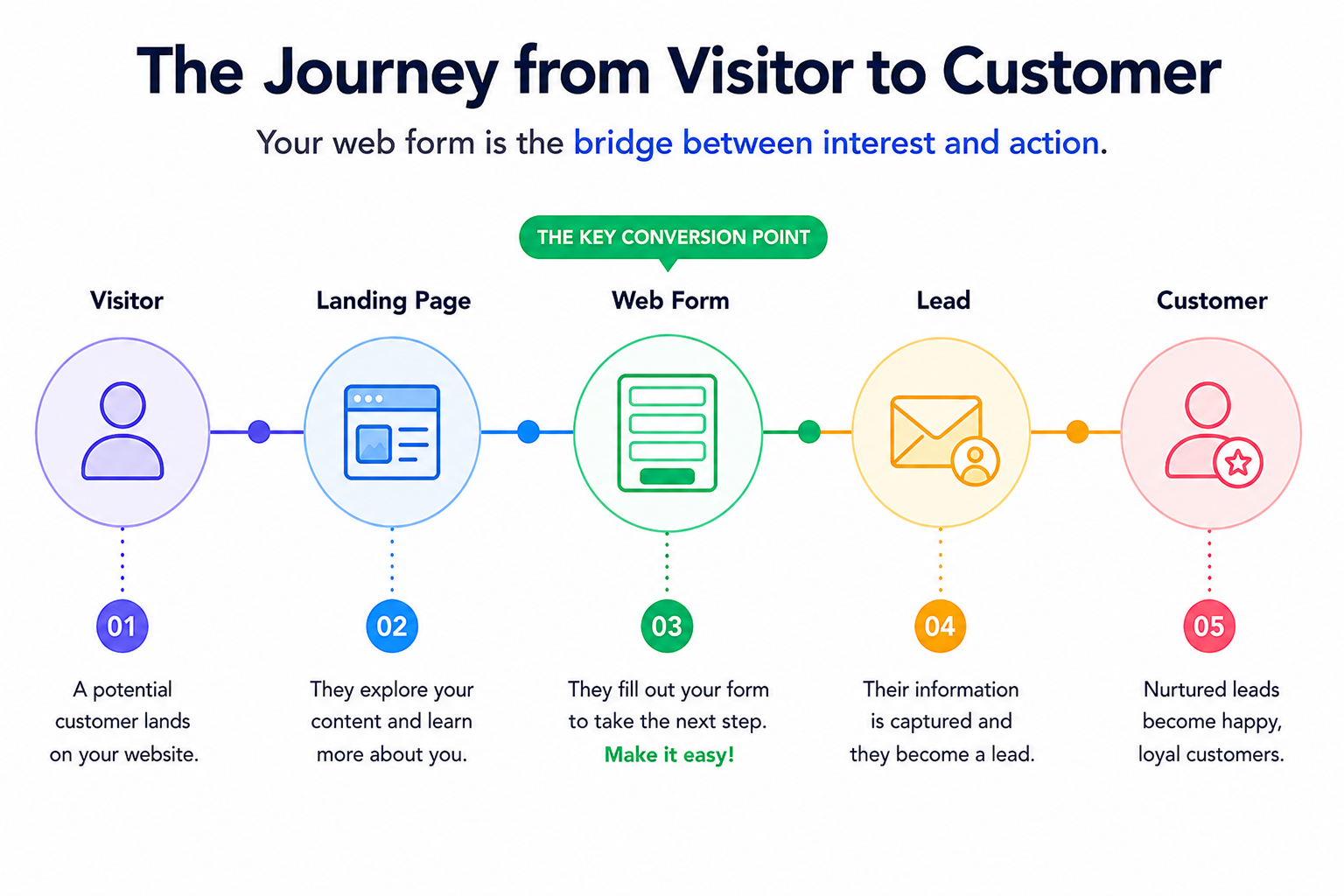
This is how visitor to customer journey actually looks.
A visitor lands on your website probably looking for services you’re offering. If you’re running a web design company that handles complex B2B projects, enterprise clients, custom development, and large-scale rebrands, a longer form can actually work in your favor.
A detailed request means the lead has already thought things through, and your sales team isn’t chasing someone who filled out three fields.
Read more: How to boost traffic and conversions with a responsive website
People don’t read forms from top to bottom the way they’d read an article. Instead, they scan them, looking for the path that actually is simple. If that path is cluttered, they hesitate. If it’s clean, they move through it almost without thinking.
Users scan forms in an F-pattern, and anything that breaks that flow, crowded fields, inconsistent spacing, can make them skip it. A multi-column layout adds friction they didn’t sign up for.
What actually helps:
At Dubai Monsters, we create easy, quick, and simple forms to answer your queries instantly. This easy to scan form is mobile friendly making the conversions easy.
Mobile matters here more than most businesses realize. With well over half of web traffic now coming from phones, a form that looks fine on desktop but forces users to pinch-zoom on mobile is losing leads it never had to lose. This is one of the first things we as a web design Dubai agency flag during an audit. We understand that form usability on mobile is often the single biggest, cheapest fix available.
Contact us to get a high converting website for your business!
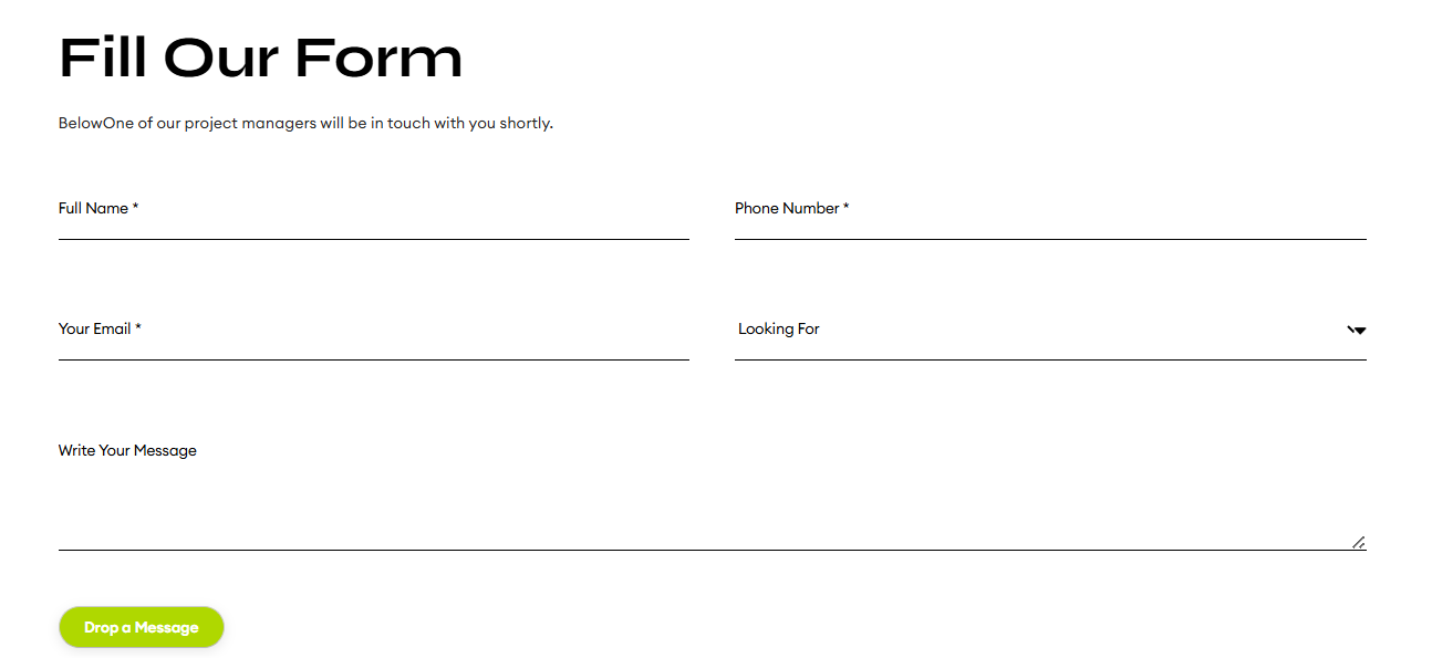
The words around your form carry more weight than you think. A simple “Submit” button tells the user nothing. It doesn’t confirm what they’ll get, when they’ll hear back, or why they should bother clicking.
Small copy changes that make a real difference:
Let’s consider some CTA examples as per your web form goals to better understand which one is best suited.
| Form Goal | Weak CTA | Better CTA |
| Lead generation | Submit | Get a Free Quote |
| Sales call | Send | Book a 15-Minute Call |
| Product demo | Continue | Request a Demo |
| Newsletter | Subscribe | Get Weekly Tips |
Nobody hands over their phone number or company details to a website that feels sketchy with long forms. If your form asks for anything beyond an email address, it needs to earn that trust in order to get it.
What tends to work:
Keep it brief. One honest sentence reassures more than a paragraph nobody reads. This matters especially for service-based businesses, such as a web design company asking for a phone number on a contact page. To see better form completion rates just by adding a single line clarifying that the number is only used to schedule a call, not for cold outreach.
Read more: Web design tips for easy conversions
A form isn’t something you design once and forget. Traffic sources shift, devices change, audiences evolve, and your form should evolve with them.
Worth tracking:
Worth testing:
Sometimes the results surprise you; a slightly longer, more qualified form can outperform a short one because it filters out the visitors who were never going to convert anyway. That’s the value of testing: it replaces guesswork with an actual answer.
High-converting forms come down to four things: they’re simple, easy to scan, trustworthy, and clear about what happens next. Whether you’re working with an in-house team or partnering with a web design company in Dubai to rebuild your site, none of these steps require a massive redesign or budget.
Trim a field, rewrite a button, add one honest sentence of reassurance; small changes like these tend to compound into a real, measurable lift in conversions over time.
Ready to revamp your website? Get a quick quote for website development from our experts!
Three to five fields are mostly used for top-of-funnel forms. It includes name, email, and one qualifying question. Longer forms can still perform well for complex B2B or service inquiries where detailed information genuinely helps the business follow up faster.
Mahnoor Khan
September 2, 2026  Mahnoor Khan
August 18, 2026
Mahnoor Khan
August 18, 2026 Table of Contents
