


 Mahnoor Khan
  September 30, 2026
  Junaid AshrafAugust 8, 2016
Choice of color is a very sensitive matter when designing a website. A lot of thought and homework is done before a color scheme is decided upon. It is because a color plays a significant role in the conversions as well. If visitors do not like the color, chances are they are not going to stick around longer.
So one thing is decided for sure that colors have an impact upon the overall design as well as the power to attract and retain potential prospects. Next, you need to choose a color palette for your website. We have gathered 10 websites that have successfully pulled off beautiful color schemes in their web design that makes them visually appealing. Let’s dive in those colors to learn more:
Table of Contents
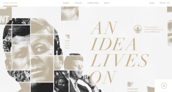
This website is perfectly packed with muted tones. Gold and off-white tones are contrasted well against the sharper blacks and whites which looks stunning. The design is simple, elegant and perfect enough for a minimal look to any sophisticated design you are about to create.

A sharp yet unique design that is modern in every way. Using various tones of orange and blue, this palette looks exuberant and bright, but not too bright to turn people away. The design is blended well with neutral whites and light greys so that it’s not overwhelming.

This is a great example of bold and high-contrast colors with a strong dark background. The striking neon accent colors are complementing the dark background so well. The purples, blues and pinks against black – a very striking effect.

To create that unique vibe, try something crazy by mixing warm and cool colors like this website here. The vibrant reds and blues are paired beautifully with darker purples and indigos that is giving off an aesthetically dreamy and bold effect.
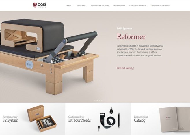
Everything looks nice and clean here, nothing overly done, all of which is tagged with a warmer touch. Light brown tones as the neutral background color are perfectly blended in with warm tones that gives an overall inviting feel to the website.

Ready to unlock a punchy palette? Take a look at this example here. Pulling off a contrast of warm oranges and yellows as against cool metallic greys packed with gunmetal tones, this website is flaunting a bold personality and a dynamic effect about it.
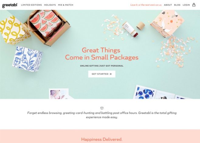
Pastel colors have a bigger purpose to serve in the world of website design than just being there on nursery walls in reality. Take a look at this website here, it looks fun with bright pastel pinks, oranges and blues which makes for an inviting palette. A significant use of whitespace has helped to keep things light and fresh.

Bright and punchy colors with a vintage feel are perfectly mixed here in this website design. There are so many colors used at once but nothing looks overdone here as there is cohesiveness about the design infused with warm consistency.

While black and white may be sophisticated, there are also other colors that can turn out to be equally elegant, like this example of a website color scheme here. Deep blue tones with subtle gold highlights looks utterly sophisticated. This palette is inspired by art history and is timeless in a beautiful way.
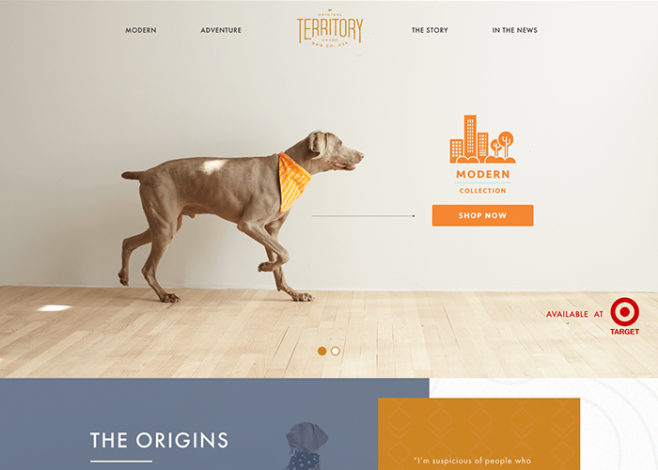
This website is light, cheerful and modern in a welcoming way. Vibrant colors are utilized well with lots of whitespace with neutral blue that acts as a balancing tone for keeping the warmth in. The color scheme here is a sensational example of how colors can add a great deal of life to a website.
Learn to use various tones, whitespaces and epic contrasts to create ever-lasting color schemes through these epic examples!
Mahnoor Khan
September 30, 2026  Mahnoor Khan
September 2, 2026
Mahnoor Khan
September 2, 2026 Table of Contents
