Best Minimalist Website Design: Why Less is More in 2025
Have you ever visited a website that instantly felt neat and clutter-free?
The minimalist website design is the new trend in 2025. No need to go overboard with your website design, as keeping it clean and aesthetically appealing is what works best. You can explore the best minimalist website design to create faster, smarter, and more engaging user experiences.
With just 8 seconds to capture attention, it is now getting hard to compel your audience to stay on the site. Attention spans are shrinking.
If your site is cluttered with pop-ups, striking graphics, and endless text blocks, users are going to leave it.
Minimalism solves this problem in no time. Cut off the distractions and focus on essentials. Your business website must deliver your brand message. It has to be clear, professional, and impactful.
But why “less is more” in 2025? The minimalist website design is making waves. Let’s take a look at minimalist website design for inspiration to help your brand stand out.
Table of Contents
What Is Minimalist Website Design?
Minimalist website design is all about simplicity. But simplicity doesn’t mean leaving the white space all over the web page. It means designing a website more strategically. Every element on the page has a purpose, whether it’s a line of text, a button, or a single accent color.
Here are the features of minimalist web design:
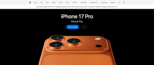
Whitespace: Whitespace (also known as negative space) is the space around text, images, or design elements. It reduces clutter and draws attention to important content. Think of Apple’s website: plenty of white space, so products shine without distraction.
Clean Typography: Clean typography always captures attention. Instead of blending five different typefaces, choose one font that works well for your minimalist website. You can explore Google fonts to see which one goes well with your brand. You can also use one or two fonts in different sizes. Make headlines bold and large to grab attention, while keeping the body text small but easy to read.
Limited Color Schemes: Minimalist sites usually have neutral or muted tones (white, black, gray, beige) with one or two accent colors. This color palette makes the web design feel cohesive without overwhelming the visitor.
Simple Navigation: A user shouldn’t be overwhelmed with cluttered menus. incorporate minimalist navigation to keep it simple and direct. Add clear categories and a streamlined structure to make the navigation easy and boost engagement.
Focused Visuals: Instead of stock image overload, visuals are intentional. A single strong image or illustration can communicate more than a gallery of irrelevant pictures.
Why the Best Minimalist Website Design Works in 2025
1. Faster Performance
Every extra image, animation, or script on a website slows it down. And speed matters, a Google study shows 53% of mobile visitors leave a site if it takes more than 3 seconds to load. Minimalist websites, with fewer elements and optimized visuals, load much faster. This improves user satisfaction and reduces bounce rates.
2. Mobile-First Compatibility
More than 64% of global web traffic comes from mobile devices. A cluttered desktop design often translates poorly to smaller screens. Minimalist designs come with streamlined layouts and automatically adapt better to mobile screens. It offers a smoother experience without endless zooming or scrolling.
3. Digital Fatigue Relief
Users today are overwhelmed by information, from constant notifications to content overload. Minimalist websites act as a breath of fresh air. Clean layouts reduce the load, allowing visitors to focus on what really matters. This makes the browsing experience more enjoyable and encourages users to stay longer.
4. SEO & Core Web Vitals
Search engines like Google now prioritize user experience. Core Web Vitals, such as page speed, interactivity, and visual stability, play a big role in SEO rankings. Minimalist websites naturally perform better because they’re lightweight, which makes them faster and less visually chaotic.
Key Features of the Best Minimalist Website Design
Creating the best minimalist website design goes beyond removing clutter. It’s about balance, clarity, and intentional design. Here are the key features explained in detail:
Whitespace Mastery Whitespace helps guide the eye. For example, when a call-to-action button is surrounded by ample whitespace, it becomes more noticeable and clickable. It also prevents information overload by breaking up sections into digestible chunks.
Strong Typography Minimalist designs rely heavily on fonts to set tone and personality. A bold sans-serif font can make a modern, confident impression, while a clean serif font conveys professionalism and trust. Typography hierarchy (headlines, subheadings, body text) ensures content flows logically.
Simple Navigation Minimalist navigation is intuitive. Instead of ten dropdown menus, there can be just four clear tabs: Home, About, Services, Contact. This doesn’t limit functionality, but it simply organizes content in a user-friendly way. You can also add services or any other tab on the navigation menu that is relevant to your business.
Intentional Imagery Every image should add meaning to your website. For instance, an e-commerce store might feature one high-quality product photo per page instead of a gallery of low-quality stock images. This reduces distractions and emphasizes high-end branding.
Limited Color Palette Fewer colors create consistency. A minimalist site might use black and white with a single bold accent (like red for buttons or blue for links). This draws attention and keeps it easy on the eye.
Microinteractions Minimal doesn’t mean static. With subtle animations, you can add more dynamism to your design. You can add subtle elements like a button that changes color every time someone hovers over it. Or you can add text sliding in gently. These small and engaging elements can make your website more aesthetic without clutter. These microinteractions improve user experience while keeping the design clean.
Benefits of Minimalist Website Design
Minimalism isn’t just visually pleasing, but it delivers real business advantages. Once you prioritise minimalism, you can see the following benefits.
Enhanced Focus on Content With fewer distractions, visitors are most likely to focus on your content and brand message. For example, a law firm’s minimalist site ensures visitors immediately see expertise and contact details instead of flashy visuals.
Higher Conversion Rates HubSpot found that simplifying landing page designs can increase conversions by up to 20%. By keeping the design simple, users are diverted toward calls-to-action like “Buy Now” or “Contact Us.”
Professional & Timeless Appeal Remember, the best minimalist website designs are less tied to trends. Unlike neon gradients or 3D visuals that might feel outdated in a year, minimalism maintains relevance and sophistication over time.
Sustainability in Design Lightweight websites consume less bandwidth and serve more sustainably. For eco-conscious companies, this aligns with values while also saving hosting costs.
Common Mistakes to Avoid in Minimalist Website Design
Minimalism, if not done right, can backfire. Here are some common pointers you should look out for while designing.
Over-Simplification A website with so much content can frustrate users. For example, removing navigation entirely in the name of minimalism forces users to keep guessing where to go next.
Poor Contrast Choosing a low contrast between text and background can minimize readability. Always make sure that the content is accessible with right color contrast, especially for visually impaired users.
Lack of Brand Personality Minimalism should not mean bland. If every minimalist site looked the same, brands would lose individuality. Use typography, accent colors, and imagery to reflect your unique identity.
Best Minimalist Website Design Inspiration (2025 Edition)
The minimum doesn’t have to be complicated; you have to keep things simple. Looking for minimalist website design inspiration? Here are some notable brands.
Apple: Known for its “less is more” philosophy. Clean visuals, plenty of whitespace, and simple navigation put products in the spotlight.
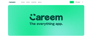
Careem: Known as the ‘super app’ of the UAE, Careem offers a clear and minimalist website design. This brand focuses on the theme color ‘Green’ paired with a muted tone. This clean and aesthetic web design allows visitors to explore Careem’s services without any distractions.
Talabat is home to the best eateries in the UAE. The design is clean and clutter-free and allows users to view and select the popular eateries in one super app!
These brands prove that minimalism isn’t about removing personality, it’s about highlighting what truly matters.
How to Create the Best Minimalist Website Design in 2025
Ready to create your own minimalist site? Here’s how:
Start with Wireframes Sketch or use tools like Figma to map out content before adding visuals. Wireframes help identify what’s essential and what can be removed.
Choose Typography Carefully Typography sets the tone of your site. A creative portfolio might use modern fonts, while a corporate brand benefits from traditional, professional typefaces.
Limit Your Color Palette Stick to 2–3 colors. For example, a black-and-white theme with a single gold accent for luxury brands creates focus and elegance.
Prioritize Navigation Navigation is the backbone of user experience. Keep menus concise, use sticky headers if needed, and ensure users can find key pages within 2–3 clicks.
Test Performance Minimalist design doesn’t guarantee speed unless optimized. Use Google PageSpeed Insights to check load times and compress images where possible.
Add Subtle Interactivity Animations like hover effects, smooth transitions, or scrolling reveals make the site engaging without cluttering it.
Want expert insights? A professional website design company in Dubai can combine cultural insights, global trends, and technical expertise to craft minimalist websites that are both beautiful and effective.
The Future of Minimalist Website Design
The future of minimalism isn’t fading but looks promising. Brands are adapting to sleek and minimalistic design to capture attention. In upcoming years you can expect these trends:
AI Personalization: Clean layouts enriched with AI-driven personalization, such as showing relevant products or content without overloading the design.
Dark Mode/Light Mode: Offering both themes for accessibility and user preference.
Eco-Friendly Design: Lightweight, minimalist websites are becoming a standard for environmentally responsible companies.
Minimalism will remain timeless! Brands are only evolving and adapting to new technologies by understanding user behaviors clearly.
Final Word
The best minimalist website design in 2025 proves that simplicity isn’t about having less, it’s about having just enough. By focusing on clarity, speed, and user experience, minimalism helps brands stand out in a crowded digital space.
Whether you’re browsing for the best minimalist website design or working with an expert, you need to understand that the “less is more” concept can transform your digital presence. In the fast-moving world of web design, minimalism remains a timeless strategy that delivers results.
When it comes to websites, less is definitely more!
FAQs
What is minimalist website design?
Minimalist website design is a design style that emphasizes simplicity, clarity, and functionality. It uses whitespace, clean typography, and limited elements to create an uncluttered, user-friendly experience.
Why is minimalist website design popular in 2025?
It improves performance, reduces digital fatigue, supports SEO, and offers a timeless, professional look that resonates with modern audiences.
How does minimalist web design improve conversions?
By removing distractions, it directs visitors’ focus toward content and calls-to-action, resulting in higher engagement and conversion rates.
Can minimalist website design still reflect brand personality?
Yes! Typography, accent colors, imagery, and layout choices can all showcase brand identity while keeping the design clean. Minimal doesn’t mean boring.
Should I hire a website design company in Dubai for a minimalist design?
If you want a professional solution tailored to your brand, yes. A website design company in Dubai often combines international design standards with local insights, delivering websites that are minimalist, functional, and aligned with business goals.


 Mahnoor Khan
  September 30, 2026