

 Mahnoor Khan
  July 17, 2026
  Mahnoor KhanDecember 12, 2025
Long gone are the days of static brochure design. You can now see brands getting more creative with the idea of brochures and creative branding.
In a world where digital media dominates attention, you can not make a lasting impression with static and plain marketing assets. It’s been estimated that the digital advertising and marketing market for 2024 is estimated at $667 billion and is projected to reach $786.2 billion by 2026.
The printed materials captivate audiences at first glance, but it’s the interactive elements that keep them hooked. Whether small or global enterprises, they rely solely on static results in a flat layout. Instead, opting for motion-inspired brochure design, you can create pieces that feel dynamic, energetic, and immersive.
While printed materials can’t move, skilled designers know how to use layout, composition, color, and form to simulate movement or depth. This subtle illusion can make brochures more engaging, making the content flow effortlessly.
Let’s take a look at how you can give a creative look to your brochures and capture your audience.
Table of Contents
When you think of “motion design,” you might think of animation or digital effects.
But motion in print is not entirely visual. It is an illusion created using strategic design elements. To simplify, you can say motion-inspired brochure design is a flat, static page that feels active and interactive.
Here are a few ways you can add motions to printed brochures:
Lines can create a sense of speed, direction, and energy. Horizontal lines feel calm and steady, while diagonal lines convey action or momentum. Vertical lines can create upward or downward movement depending on their spacing and thickness.
Instead of keeping everything aligned straight, designers can create angled images, shapes, or text blocks. These subtle elements can generate a feeling of instability or forward motion that keeps the viewer visually engaged.
Layers reflect progression. It is like giving a reference to your audience about what your brand is about. When different elements overlap intentionally, it signals a transition from one piece of information to the next.
Sequential visuals create a step-by-step illustration. The layouts that reveal information in stages can mimic animation storytelling. Each section of the brochure can help lead into the next as if the visuals are moving forward.
Soft curves and organic lines reflect the movement of water, wind, or fabric. You can use these elements if you wish to add elegant aesthetics to the brochure design.
Motion in print doesn’t mean you have to play with tricks; it is all about smart design choices. And smart design is crucial for brands looking to make an impact.
Once you understand what a motion brochure static design is, the next step is learning how to bring it to life.
Designers often combine multiple techniques to create a compelling sense of visual rhythm.
Curves suggest natural movement; they’re more dynamic than rigid rectangles or straight lines. Designers use curves to guide the eye from the front cover to the inner pages or from one section to another. They symbolize flexibility, innovation, or creativity, depending on the brand.
Repeating patterns (like dots, arrows, or icons) can create motion, especially when they diminish or increase in size. This creates a sense of acceleration or deceleration in the brochure design.
Gradients are great for adding soft movement. When colors transition smoothly across the page, it creates an invisible sense of flow, making the design feel more alive. Color gradients also add subtle depth, complementing other dimensional elements to the design.
Diagonal imagery reflects excitement and direction. A tilted photograph or an angled color block can add more creativity to a plain brochure layout. This is one of the most effective brochure layout techniques for brands wanting a bold, contemporary look.
Using sequential blocks or numbered sections helps get through the storyboard. This approach mimics the flow of movement and adds clarity to educational or informational brochures.
Strategic cropping can make images extend beyond the layout. For example, a car cropped mid-frame appears to be in the middle of driving forward.
With these elements, you can create brochure design ideas that feel dynamic, intentional, and visually stimulating. The ultimate goal is not to overwhelm the reader but to create an intuitive flow through the content.
While motion brochures enhance flow, depth makes brochures feel more tactile, immersive, and premium. You can add dimension to the design to transform a simple design into one that feels sophisticated and engaging.
Soft shadows behind text blocks or images create a subtle 3D look. Highlights can also add the illusion of raised or embossed surfaces. These elements can give brochures a clean and modern aesthetic look that makes you stand out.
Layering is one of the most popular ways to add depth in print design. By letting images overlap text or putting shapes behind background textures, you can create visual hierarchies that mimic physical layering.
Adding textures like grain, noise, paper fibers, metallic foils, or matte finishes adds tactile depth even when viewed visually. They make brochures feel high-end and help differentiate key content sections.
Perspective creates the illusion of distance or direction. For example, placing an image at a slight angle with a fade-out effect can make it appear as if it’s receding or emerging from the page.
While brochures are plain printed, you can add 3D shapes with highlights, gradients, and shadows to make them more eye-catching. Geometric shapes, spheres, or stacked layers often create the illusion of a tangible structure.
By combining depth and motion-inspired elements, designers can produce modern brochure concepts that feel surprisingly immersive. It can create a hybrid look that balances both print and digital-style design.
Design isn’t just about aesthetics; it’s about effectiveness.
Motion-inspired brochure design and dimensional techniques can enhance reader engagement and information retention, empowering your brand to create a lasting impression.
Here’s why this approach works so well:
Dynamic layouts help you take a break from traditional layouts. This brochure design can enhance the visual feel active. In this manner, the reader can stay more focused and scan through the entire brochure.
Motion brochures have elements that guide the eye smoothly from one section to another. This makes complex content easier to digest, crucial for industries like real estate, tech, and healthcare.
Every brand has a story to tell. By adding motion and depth, you can create a narrative that enhances emotional impact and gives readers a more immersive experience.
In a crowded marketplace, companies need fresh brochure design ideas that stand out. Motion-inspired brochure design elevates the brand by demonstrating creativity, innovation, and professionalism.
Depth can help organize content visually, establishing a hierarchy that makes the brochure easier to scan. Important details can be emphasized more effectively when dimensional techniques are used intentionally.
Whether you’re designing a sales brochure, event guide, product catalog, or tourism booklet, motion and depth can dramatically improve how your message is received.
Incorporating motion and depth into print is exciting, but it requires finesse. Here are some best practices to ensure your designs remain clean, balanced, and on-brand.
Even with dynamic shapes and layers, balance is key. Asymmetry can be visually striking, but make sure the design doesn’t feel chaotic or cluttered.
Typography must remain clear. Avoid overwhelming text areas with too many dynamic elements. Use motion-inspired graphics strategically around, never on top of, important content.
Less is often more. Overusing diagonals, gradients, or motion lines can feel forced. Select a few techniques and apply them consistently.
Color impacts both movement and depth. Warm colors tend to advance, while cool colors recede. Use this natural hierarchy intentionally when designing.
A luxury brand may prefer elegant gradients and subtle shadows. A tech company might embrace futuristic angles and layered digital textures. Always align your brochure layout techniques with the brand’s identity.
Some effects look different on screen than in print. Designers should always run print tests to ensure depth, shadows, and gradients appear exactly as intended.
Depth relies heavily on clarity. Low-resolution images weaken the effect and make brochures look outdated.
Following these guidelines will ensure your motion-inspired designs remain elevated, intentional, and professionally executed. For expert assistance, you need to look for a premium brochure design in Dubai. Considering the fact that Dubai is a hub of innovation, you can never get a competitive edge than partnering with an expert.
Motion-inspired brochure design is versatile and valuable across many industries. Here are a few places where these techniques truly shine:

These types of motion brochures give an overview of products, but in a dynamic way. No one wants to read plain, boring text and the history of your product. Adding motion elements can lift up the whole design, just like presented above.
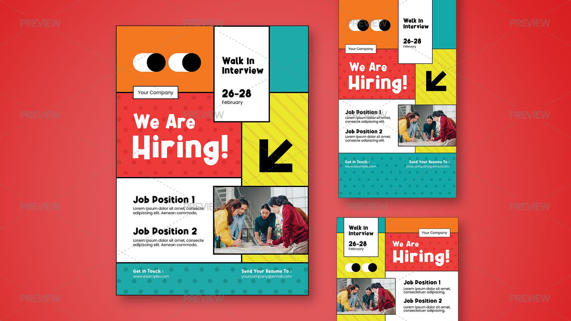
Dynamic layouts add energy and excitement, helping illustrate schedules, speaker highlights, or venue maps in a visually engaging way.
These motion brochure designs are perfect examples that reflect brand storytelling in a compelling way.
Motion-inspired brochure design is more than a visual trend; it’s a practical evolution in the world of printed marketing.
By adding motion elements, layered layouts, gradients, perspective, and depth, you can craft brochures that feel dynamic, immersive, and modern.
If not, you can also search for brochure design ideas beyond traditional layouts. Partnering with an expert for brochure design in Dubai, you can transform a simple print material into a storytelling experience that screams attention.
Remember, your consumers are constantly looking for visually engaging content, adding movement and depth to ensure your brochures stay memorable, intuitive, and effective. Irrespective of the industry, motion brochures allow you to create depth in print design that enables your brand to stand out and communicate your message with impact.
If you’re looking to explore modern brochure concepts or revamp your brand’s printed materials, consider how motion and depth can breathe new life into your designs. The results are not just visually impressive, they’re strategically powerful.
Mahnoor Khan
July 17, 2026  Mahnoor Khan
July 9, 2026
Mahnoor Khan
July 9, 2026 Table of Contents
